Last update: 2022-05-05 | BALANCEMASTER Version: 1.3.0
User Guide Contents
General
User Interface – Preferences Dialog
User Interface – Histogram Section
User Interface – Average Section
- Median Brightness Indicators
- Balance Indicator
- Average Color Name
- Saturation
- HSL
- LAB
- Average & inverted Average Colors
- Delta E
User Interface – Edit Section
User Interface – Stats Section
User Interface – Clipping Section
User Interface – Endpoints Section
User Interface – ConSpector Panel
Usage Examples
- Correcting color casts
- ConSpector / perceptual beam
- Manually converting negative film
- Inspecting image areas selectively
Other
General
Thank you for purchasing BalanceMaster. Please read these instructions carefully. If you have further questions you can reach us via the contact form or join the NEGMASTER group on Facebook for help from the community.
Installation
Balancemaster needs at least Photoshop CC 23.0.0 to work.
After downloading the plugin zip file from your account, simply unzip it and double click the resulting .ccx file. The Creative Cloud app will then install the plugin locally. Please confirm the notification about third party developers during the installation process.
Troubles installing?
Installing .ccx files usually works fine. It’s very unlikely that issues are related to our installation package. You can still run into troubles with the Adobe Creative Cloud App. Especially when it’s outdated.
There is a bug in the creative cloud app, that will break file association with .ccx files on Windows. If you see a pop-up telling you “Creative Cloud cannot open files of this type”, try right clicking the .ccx file and open it with the “unifiedPluginInstallerAgent”. Or re-install the Creative Cloud App to fix this issue permanently.
However, this is the only issue we’ve run into so far.
Here is a link to Adobe’s add-on istallation trouble shooting guide in case you run into other problems.
Activation
After installation you can start Balancemaster from the plugin dropdown in the Photoshop top menu bar. On first start, the plugin will ask you to enter your license key. You can find your license key in the order confirmation email and in your account in the license keys section.
Please copy your license key and paste it into the text field. After clicking on submit, the plugin will validate your license key and if everything is correct, the plugin interface will show.
Activating can take up to five seconds, depending on server traffic or speed of your internet connection. If you are experiencing any problems please wait some minutes and try again. If activation is still not possible please open a support ticket.
Re-Activation
For preventing piracy, once in a while (around once per month) the plugin will lock down the interface and ask for re-activation by entering your license key. You can find your license key in the order confirmation email and in your account in the license keys section.
Please copy your license key and paste it into the text field. After clicking on submit, the plugin will validate your license key and if everything is correct, the plugin interface will show again.
Updating to a newer Version
You can check for the currently installed version on the bottom left of the plugin window. Balancemaster will automatically check for updates on the Negmaster server. Once an update is available the version number will change to a clickable link “Update to Vx.x.x is available”. Simply click on the link. It will lead to your account on negmaster.com, where you can download the latest version.
After downloading, the procedure for updating is the same as for the installation. The Adobe CC app will ask if you want to overwrite the currently installed version. Please confirm with “Yes”.
If you are asked for the serial key on first plugin start after updating, please deactivate your license key before activating.
Deactivation
You can deactivate your license key for switching activations between different computers. As any other Photoshop window, the plugin has a flyout menu on the top right of the plugin window. There you will find the plugin preferences and user guide menu items and below the item for initiating the deactivation.
After clicking on the deactivation menu point a dialog will open, asking for your license key. Your license key can be found in the order confirmation email and in the license keys section of your account. Simply copy your license key and paste it into the text field and submit. After successful validation, the plugin interface will lock down and you can use your license key for activation on a different computer.
Deactivating can take up to five seconds, depending on server traffic or speed of your internet connection. If you are experiencing any problems please wait some minutes and try again. If deactivation is still not possible please open a support ticket.
Uninstalling
Uninstalling is straight forward. Simply open the Creative Cloud app and remove Balancemaster from the installed plugins.
In case you want to sell your computer or want to use your license key on another device, you should deactivate before uninstalling.
Preferences
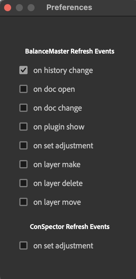
As any other Photoshop window, the plugin has a flyout menu on the top right of the plugin window. There you will find the menu item for opening the plugin preferences.
The preferences control when the plugin will refresh histogram data.
Refreshing is bound to so called “events”. Events are fired by Photoshop after certain actions are triggered by the user. Make sure to only activate the options you really need. For example activating “on set adjustment” and “on history change” will lead to refreshing the histogram twice. Because setting an adjustment will create a history entry.
The plugin can listen to the following events:
BalanceMaster refresh Events
- on history change: After a history event was fired*
- on doc open: After user opened a document
- on doc change: After user switched between documents
- on plugin show: After user started the plugin
- on set adjustment: After user made an adjustment
- on make layer: After user created a layer
- on layer move: After user moved a layer
- on layer delete: After user deleted a layer
ConSpector refresh Events
- on set adjustment: After user made an adjustment in PS panel will show effect
*on history change will listen to nearly any event that happens in Photoshop’s UI and can affect the performance of the plugin when many events are fired in a row.
User Interface – Histogram Box
RGBYMC Checkboxes

The RGBYMC checkboxes are located at the very top of the plugin’s interface. By activating and deactivating the checkboxes, the histogram and histogram median visual representation will be switched on and off. This can be useful if the user wants to concentrate on particular color channels or on only one channel.
On first startup all checkboxes are deactivated. Please activate the channels you like to examine before proceeding. By checking a checkbox, the state of the checkbox will be saved to your hard drive.
Refresh Button
By clicking the refresh button, the plugin will fetch new histogram data from the image pixels and re-populate all section in the user interface including slider settings to existing BalanceMaster proprietary adjustment layers. This is the manual way of refreshing data. There are also ways to automatically refresh data on certain events as explained in the guide for using the plugin preferences.
As the plugin always fetches accurate data without cache scrambling, it can sometimes take up to several seconds until the fresh data is calculated. This depends on the image dimensions and number of adjustment layers, as the histogram is calculated pixel by pixel. In this case automatic refreshing can be annoying and the user may want to only refresh manually.
Histogram
The histogram shows the red, green, blue, yellow, magenta and composite channels with a linear representation. The x-axis shows the tonal distribution, spread over 256 bins, starting from bin 0 and ending with bin 255. The histogram box is exactly 256 pixels wide, each bin has the width of one pixel. The height is 100px, while the frequency of the highest peak in all three color channels is downscaled to max 100px.
Opposed to Photoshop’s native histogram, the y-axis scales correctly to image resolution. This means the highest peak will never exceed the histogram canvas.
While in Photoshop’s native histogram the composite channel is calculated “wrong”, the plugin’s visual representation shows the correct values. Adobe decided to divide the sum of the channels by four. They did this, because the correct divider of three will lead to overlay the single color channels representation.
We decided to show the correct representation and to offer a possibilitiy to switch single channel representations on and off with the RGBYMC-checkboxes.
The plugin’s histogram values are not smoothed as in the native histogram, representing the exact amount of pixels in the exact correct bins. This is useful when a user has to deal with banding / tonal ruptures. The native histogram won’t show one or two pixel wide gaps in the tonal distribution because of smoothing.
For performance reasons, the native histogram get’s scrambled when histogram caching stages are activated, while the plugin histogram always fetches true pixel data. This comes at the cost of loosing visual real time changes, because calculating large images data with up to several hundreds of millions of pixels per channel takes too long to be shown in real time. But the overall gain in accuracy when color correcting or editing images makes it worth waiting a second.
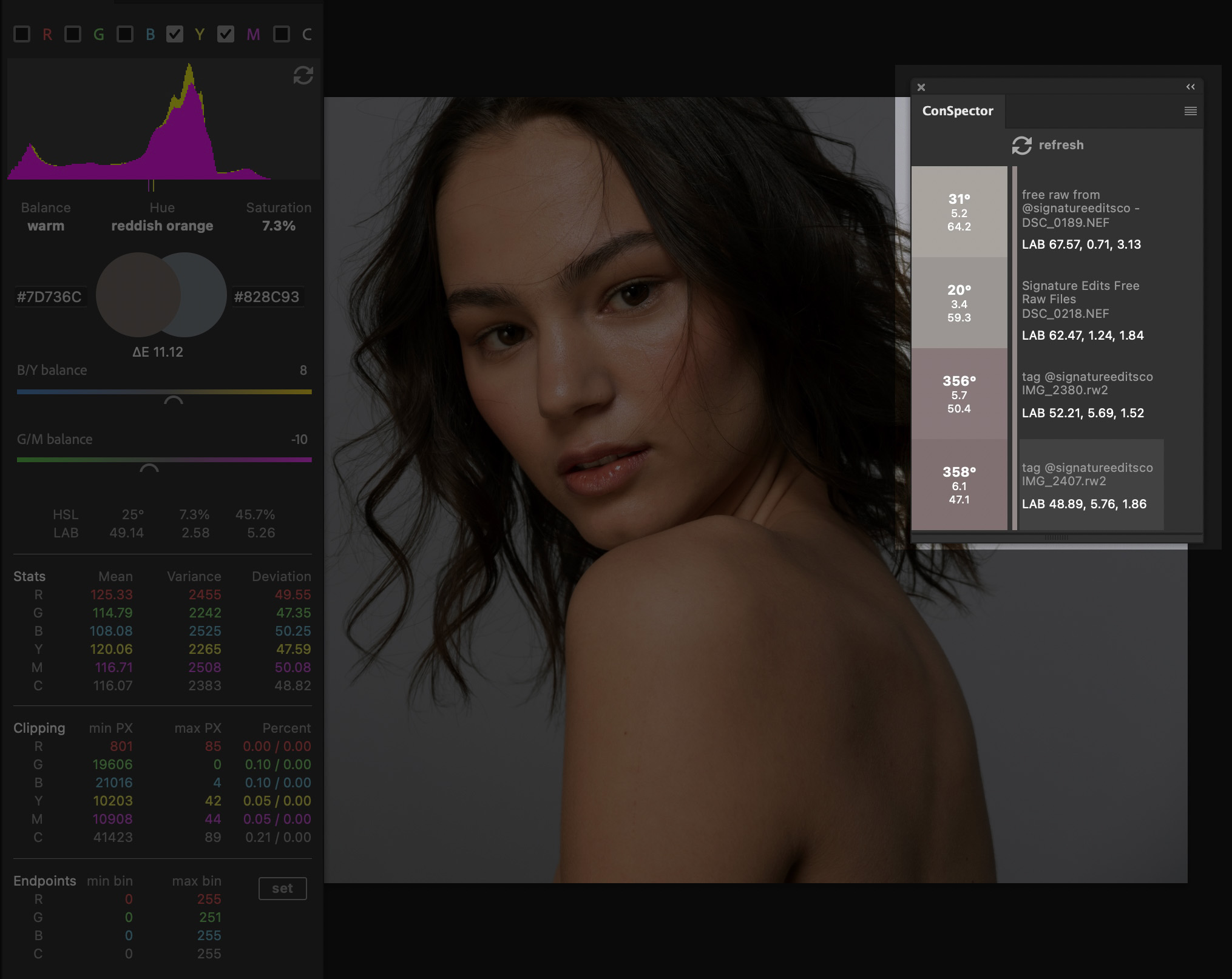
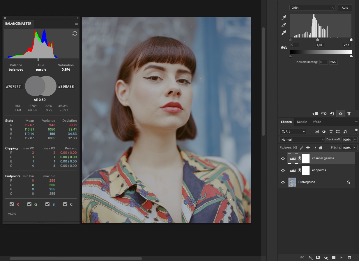
User Interface – Average Section
The average section deals with average values calculated from the histogram’s stochastic data.
Median Brightness Indicators
The median brightness indicators are a visual representation of the center average brightness of the red, green, blue and composite color channels.
They serve the purpose of judging the tonal distribution of an image at a glance. You could also call them the “what is wrong here” – indicators.
The indicators (as well as the histogram) always refer to the scene of an image. That means there is no clear statement about where the indicators should be located for being able to say “this is what it the indicators position has to be”. But when comparing two images from the same scene, a user can easily judge which channels are too bright or too dark or if the overall brightness between an arbitrary amount of images shows deviations.
After using the plugin for a longer time the median indicators will be quite helpful even when judging single shots. This has to do with shooting and editing style, as experienced photographers often pursue consistency in choosing their rig, scenes, subjects and (color-) compositions.
An experienced user would quickly notice when and why things are off.
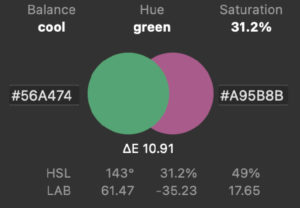
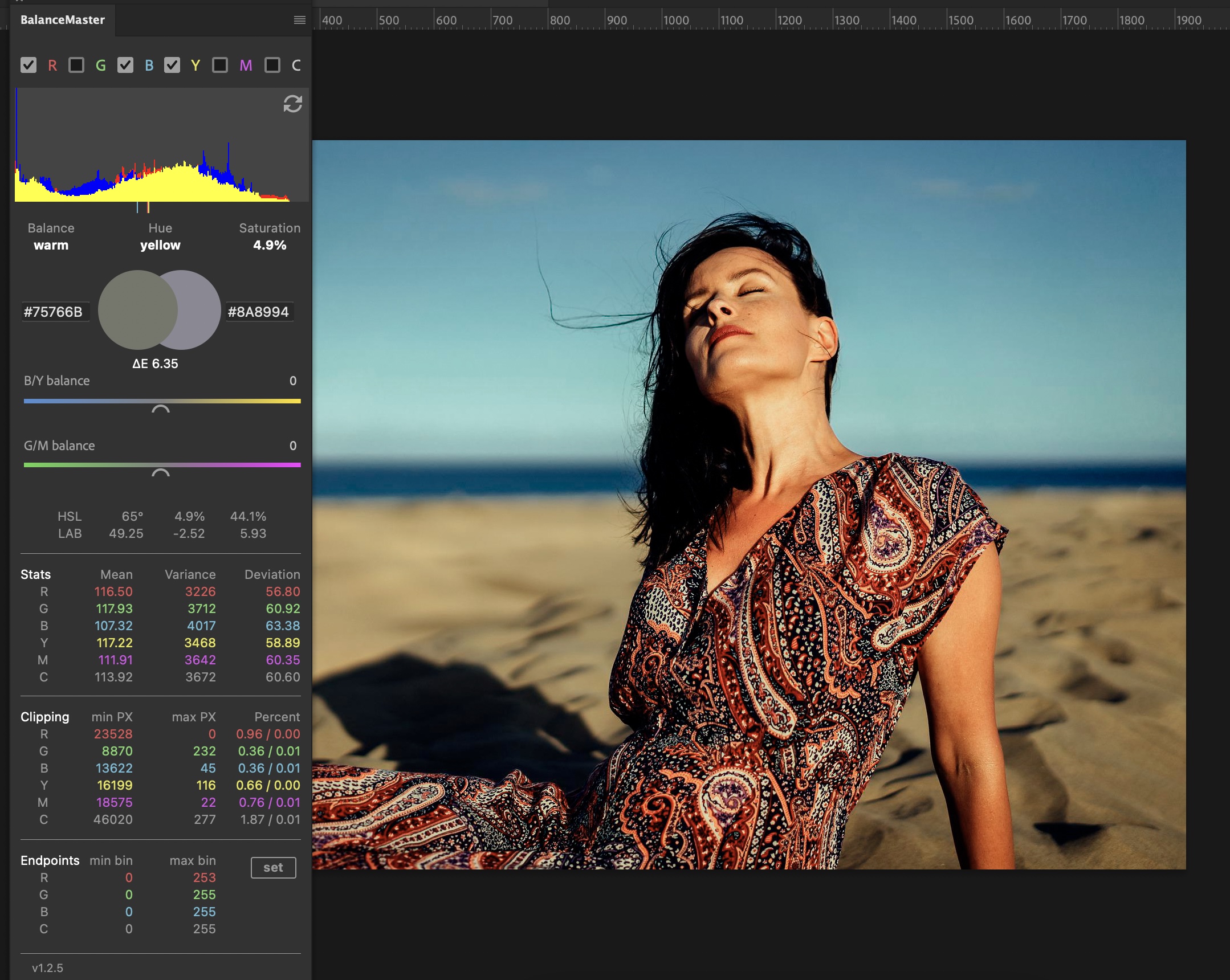
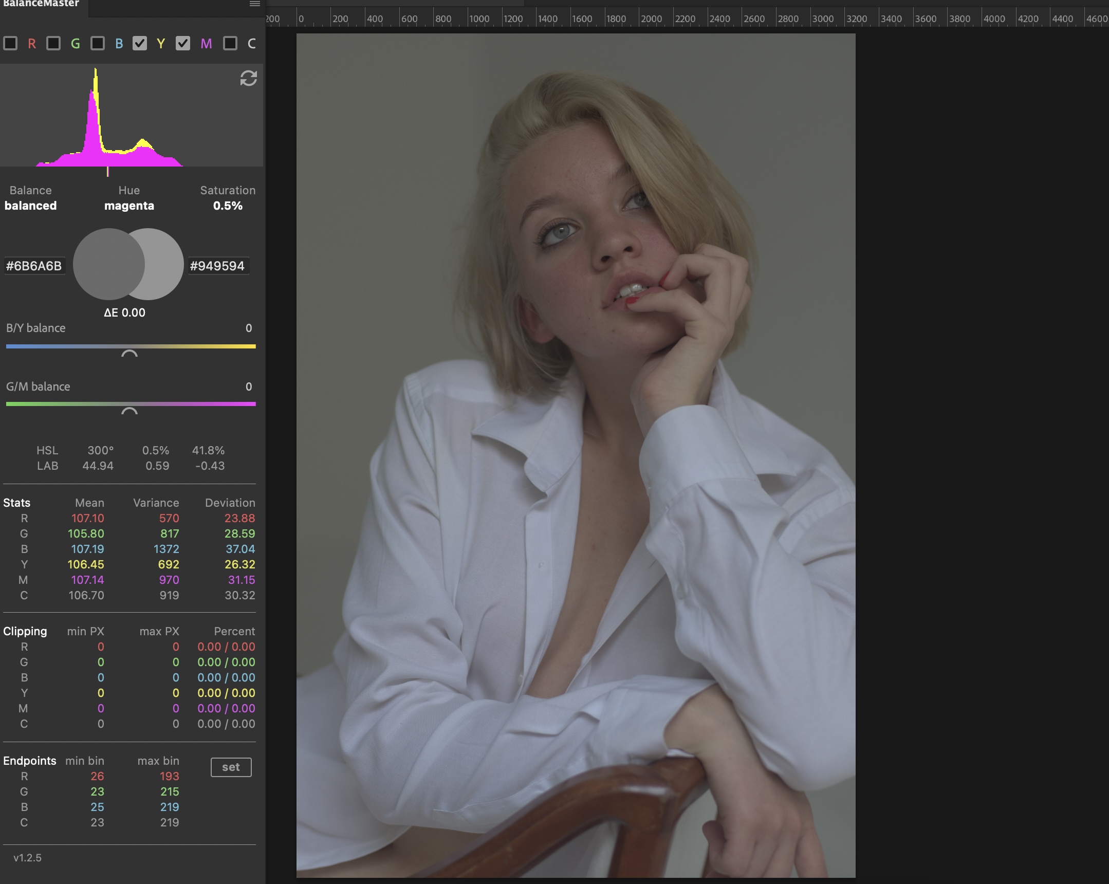
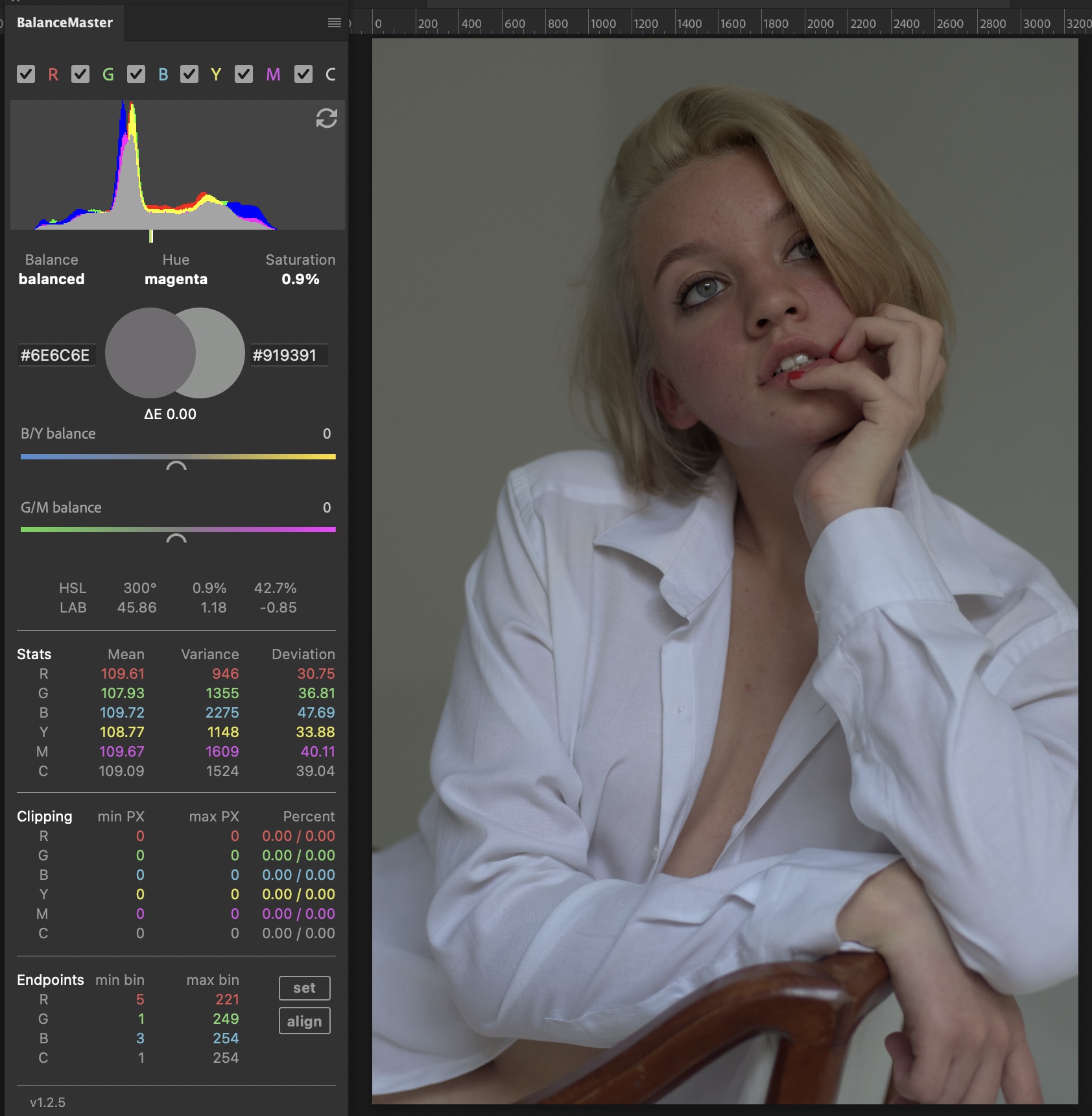
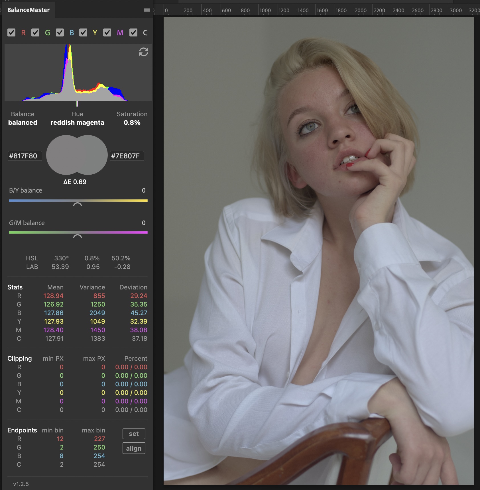
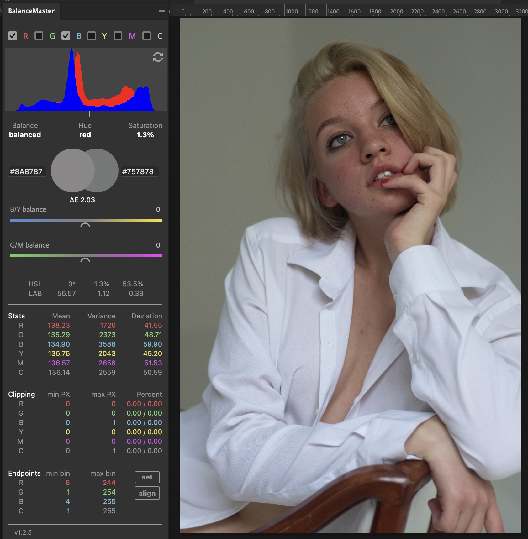
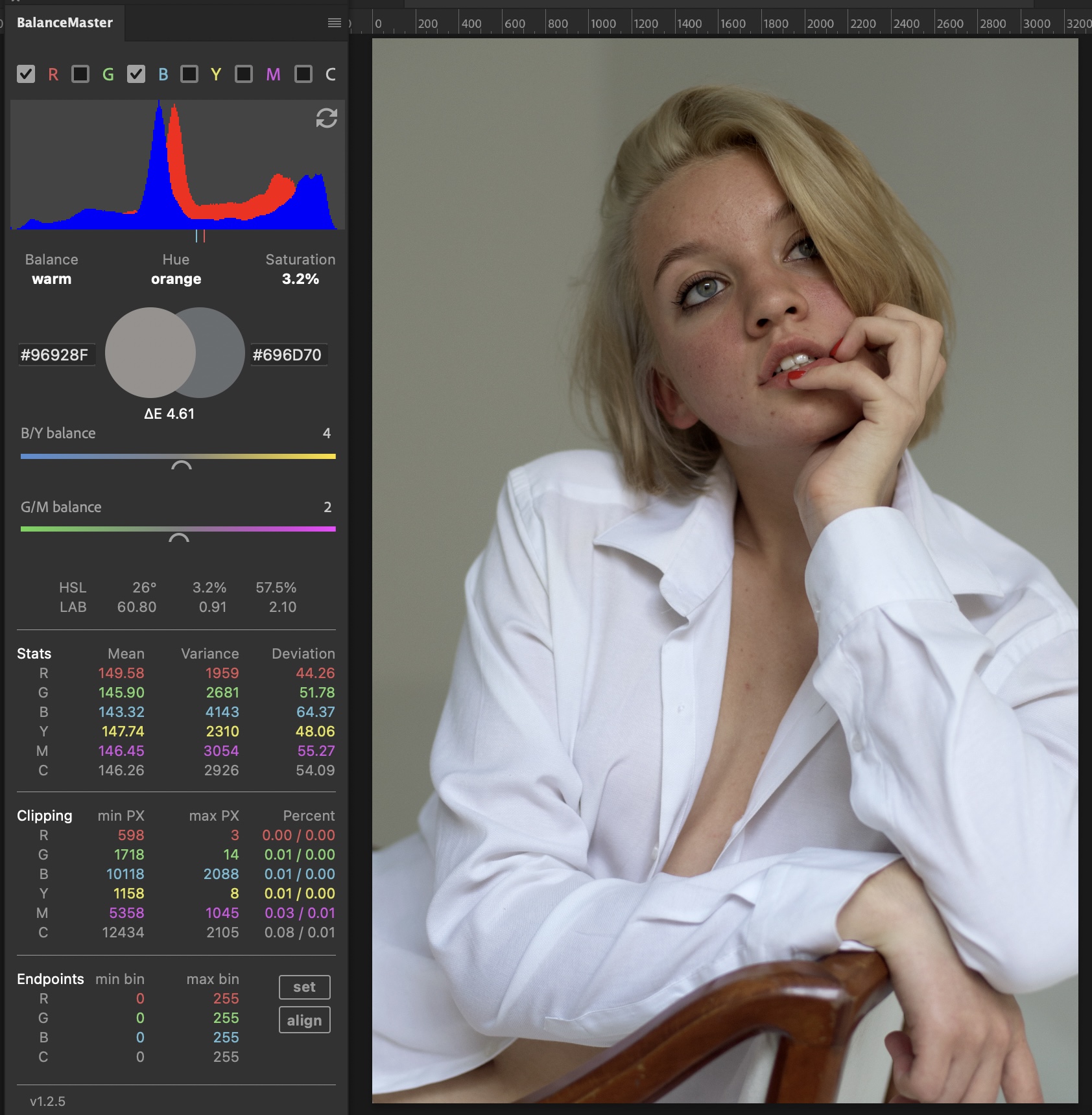
Balance Indicator
The balance indicator has three different states that describe the average color representation of an image as:
- cool
- balanced
- warm
These states are calculated by adding the averaged LAB A and B channels and dividing them by two. The resulting value will either be positive or negative.
In the LAB color model, negative values describe cool colors while positive values describe warm colors. A resulting value between the tolerance of -1 and +1 will be considered as balanced.
Average Color Name
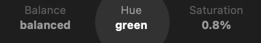
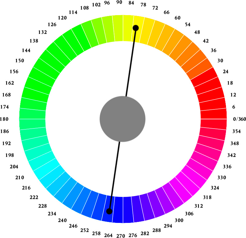
The average color name is calculated by hue. Hue is traditionally visualized in a a circular shape beginning with red (0°) and ending with red (359°). Inbetween are all other hues that can mostly be referenced to in 30° increments while the different shades of green have a bigger increment around 50° because the human eye is more sensitive to green colors.
The plugin calculates the average hue of the image and references it’s degree value on the color wheel to 16 different human understandable color names.
| degree | operator | degree | designation |
| 0 | >= & <= | 15 | red |
| 16 | >= & <= | 25 | reddish orange |
| 26 | >= & <= | 37 | orange |
| 37 | >= & <= | 45 | yellowish orange |
| 46 | >= & <= | 70 | yellow |
| 71 | >= & <= | 79 | yellowish green |
| 80 | >= & <= | 163 | green |
| 164 | >= & <= | 182 | greenish cyan |
| 183 | >= & <= | 190 | cyan |
| 191 | >= & <= | 260 | blue |
| 261 | >= & <= | 289 | purpleish blue |
| 290 | >= & <= | 297 | purple |
| 297 | >= & <= | 327 | magentaish purple |
| 328 | >= & <= | 344 | magenta |
| 345 | >= & <= | 349 | reddish magenta |
| 350 | >= & <= | 359 | red |
Saturation
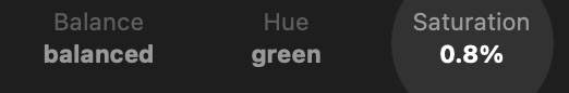
Average image saturation is taken from average image HSL. High saturation usually indicates either a strong color cast or a scene based on a dominant color. For example when a photographer takes a picture of a blue wall, you would expect a high saturation value, while a picture with a beach scene with 50% yellow sand and 50% blue sky would be expected to show 0% saturation.
Explanation: blue and yellow are complimentary colors. They compensate each other. So the “formula” is
blue+yellow/2 = neutral gray (low saturation)
or for the blue wall example
blue+blue/2 = blue (high saturation)
or for a third example where we imagine a typical landscape scene where 1/3 of the image is the beach and 2/3 of the scene is sky
blue+blue+yellow/2 = blue (low saturation)
In conclusion the average saturation will tell you:
- how strong an obvious color cast is
- how high the average saturation is to be expected within a certain scene
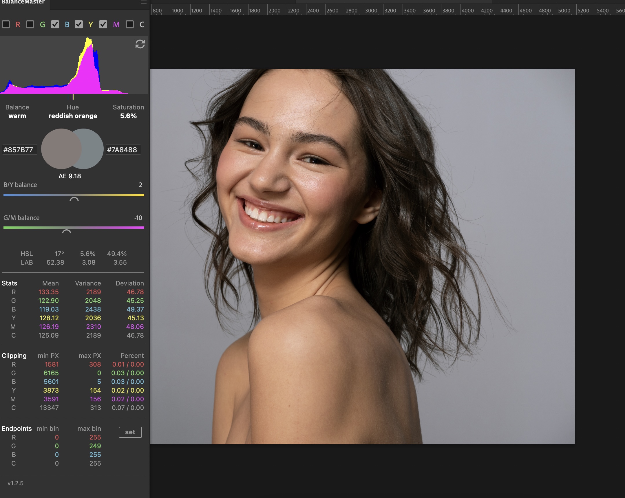
User Interface – Edit Section
B/Y and G/M Sliders
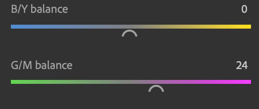
Once the user drags one of the sliders, a levels adjustment layer with the name “BM-Temperature”, respectively “BM-Tint” is created and the values in the layers change accordingly to the user’s adjustment.
If more than one document was edited with the sliders, the values of the sliders in the plugin will sync to already existing “BM-Temperature” and “BM-Tint” adjustment layers when switching between documents.
A right click on one of the sliders will reset values to default (0).
The “B/Y” and “G/M” sliders control the color balance on the blue/yellow and green/magenta axis by moving the blue, red and green gamma values in a levels layer simultaneously, while the levels layer is in blend mode “color”.
The blend mode color is used, because it will not alter brightness of the image while making balance adjustments. If the user whishes to have an effect on brightness, the blend mode should be switched to “normal”. This allows for maximum deltaE correction including brightness.
In blend mode color, the sliders are designed to work like a compromise of a L*A*B emulation and white balance known from the Adobe Camera RAW module.
Switching all color channels but magenta and yellow off is recommended for the best possible visualization of the process of balancing.
The sliders are serving as an easier to use alternative to Photoshop’s own adjustment layers for color balance, mimicing the white balance sliders in Camera RAW and L*A*B channel A and B adjustment in blend mode “color”.
Composite Slider
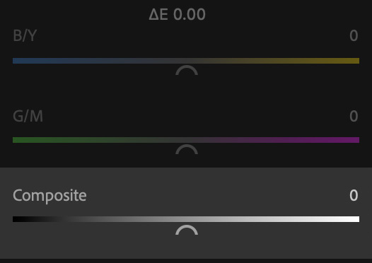
Once the user drags this slider, a levels adjustment layer with the name “BM-Composite” is created and the values in this layer change accordingly to the user’s adjustment.
If more than one document was edited with this slider, the values of the slider in the plugin will sync to already existing “BM-Composite” adjustment layers when switching between documents.
A right click on the slider will reset it’s value to default (0).
The Composite slider controls the balance of composite brightness by moving the blue, red and green channels simultaneously to the left or right of the histogram.
This slider is designed to work similar to adjusting L*A*B Lightness without loosing information in the highlights or shadows of an image. It is serving as an alternative to Photoshop’s own adjustment layers for brightness/gamma/exposure with a different approach on adjusting brightness without inducing changes in contrast gradation.
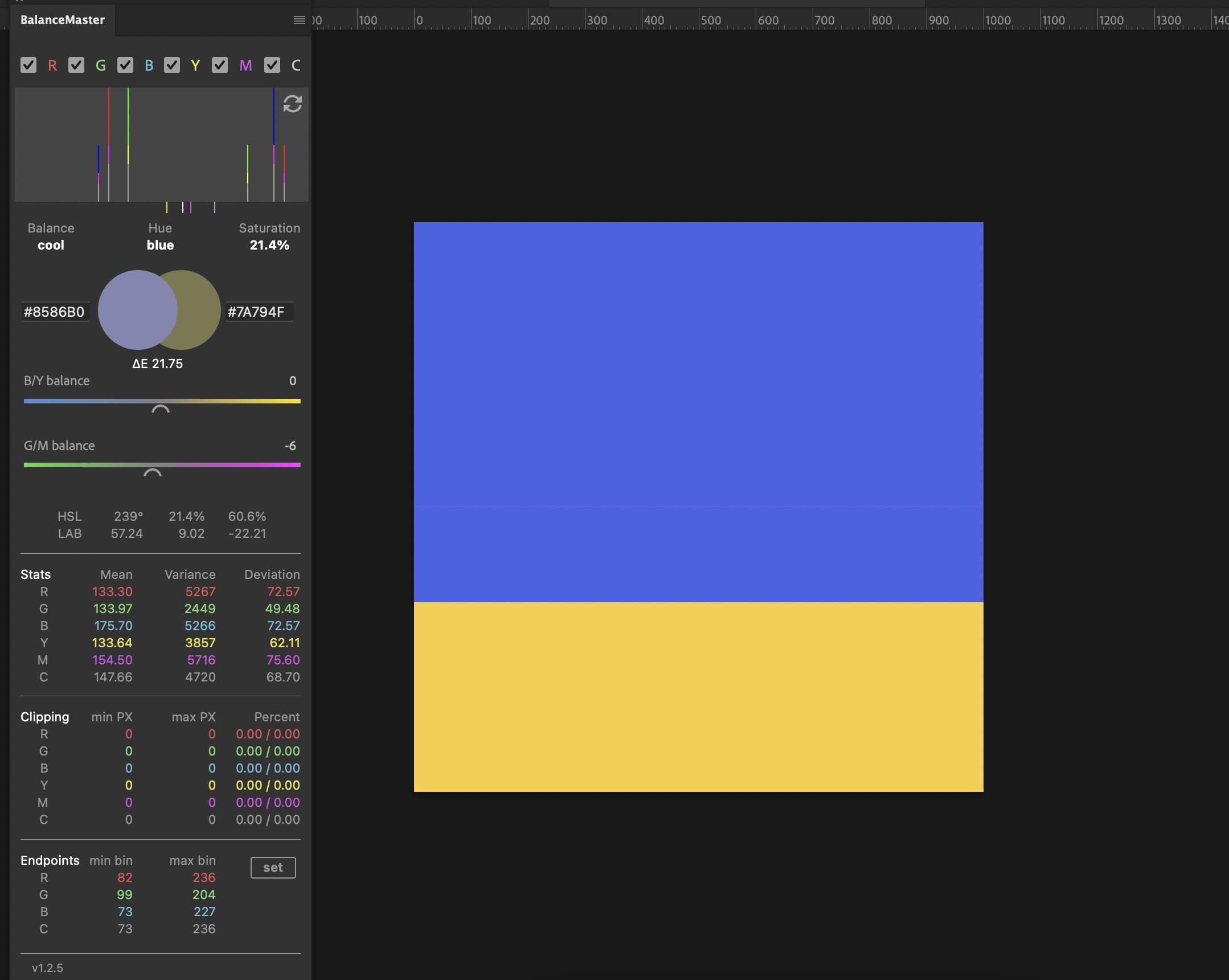
Average & Inverted Average Colors
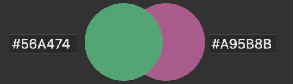
The indicators show the average (on the left) and inverted average color (on the right) of the actual image. Mathematically, the sum of both indicators will always equal neutral gray. A mathematical neutral gray means the image is “scientifically” in a state of perfect balance.
Depending on what scene you are analyzing, a near mathematical perfect balance can be desirable. In fact, the human eye prefers images that are in balance. This effect is often used in movies with complementary color schemes.
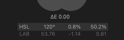
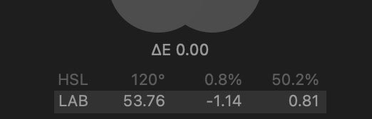
The higher the “visual gap” between the two indicators is, the more the image or scene is out of balance. This gap is called “delta”. The LAB color model is an approach of simulating human eye color perception and can be used to calculate this delta. The result is called “delta E“. So the indicators are a visual representation of delta E.
You can use them for getting a feel for
- how far the actual image is away from being scientifically neutral
- how far the actual image is away from being perfectly exposed
- what color is needed to compensate for a color cast
- the deviation between two different documents
In case you suffer from color blindness this tool can be quite helpful when dealing with unwanted green casts as the inverted indicator will show as magenta.
The two text fields on the left and right of the indicators show the respective colors as HEX codes. You can copy them and make a solid color adjustment layer in that color in blend mode “screen” or “soft light” for compensating for color casts. Layer opacity is usually to be adjusted to around 5-20%.
Delta E

Delta E is used to describe how far two colors are away from each other in the LAB color model. In our case it describes the deviation between the current image’s average color and the current inverted average color of the same image, what means that ΔE/2 equals the distance of the current average color locus to it’s mathematical neutral color.
In the CMC system, the value ΔE = 1 is noted as “still tolerable color deviation”. Since, despite the improvements achieved, color spaces are only perceived in the immediate vicinity of the color locus, a ΔE = 5 and higher is to be seen as another color.
The Delta E indicator is the mathematical representation of the above mentioned visual gap between the average and inverted average color. It serves the same purpose but differences in numbers are easier to spot when both colors are very close to each other. This feature is especially helpful when examining two documents that seem equal at a first glance. For example “same” scans from two different scanners or “same” photos from two different cameras.
| ΔE | Perception |
| 0 – 0.5 | nearly not noticeable color deviation |
| 0.5 – 1.0 | color deviation noticeable for the trained eye |
| 1.0 – 2.0 | minor color deviation |
| 2.0 – 4.0 | definitely noticeable color deviation |
| 4.0 – 5.0 | huge color deviation |
| above 5.0 | different color |
HSL
When it comes to color matching, the HSV model is preferred over the RGB and CMYK alternatives because it more closely matches human color perception (for example, in the RGB model, it’s hard to think of yellow as a mixture of red and green). For color mixing, you can immediately choose the desired shade and then decide how saturated and how light (or dark) it should be, or whether another shade is more suitable: The hue angle specifies the dominant wavelength of the color, except in the region between blue-violet and red (240° and 360°) where it indicates a position on the purple line. Saturation corresponds to the admixture of pure white (i.e. light with equal intensities at all wavelengths) to a simulated spectral color (or rather the corresponding slit width around the dominant wavelength). More white admixture corresponds to lower saturation. The brightness is a parameter for the total energy content or for the maximum amplitude of the light. The dark level complements this value in the opposite way. The disadvantage of the dark level is that white and any hue can have the same saturation. In this system, white is treated as a chromatic color.
That’s why the plugin will even show a color name in the average color name section, even if it appears to be mathematically neutral.
The HSL designation used in the plugin refers to “real” HSL (Lightness) and not to HSB (Brightness), which is natively used by Photoshop. The difference is that L describes a relative brightness while B describes an absolute Brightness, what makes HSB device dependent, while HSL can have very light colors that are still highly saturated – which contradicts our color perception.
While we thought about what color model is the best to offer to the user, we decided for HSL for the reason that HSL is missing in Photoshop.
LAB
The most important properties of the L*a*b* color model include device independence and perception-relatedness, i.e. colors are defined as they are perceived by a normal observer under standard lighting conditions, regardless of how they are generated or how they are reproduced.
For our use case, however, LAB offers the advantage of showing negative values for cool colors and positive values for warm colors on the A und B axis.
In simple terms, LAB works like the white balance you know from Lightroom or Photoshop plus an aditional axis for L (lightness).
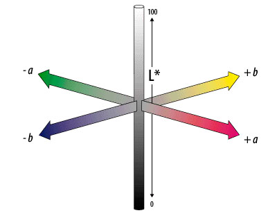
In the LAB world LAB 50,0,0 would be a neutral gray, the equivalent to RGB 128,128,128.
The L coordinate nominally ranges from 0 to 100. The range of A and B coordinates is technically unbounded, though it is commonly referred to the range of −128 to 127. Some people speak of percent when talking about L*A*B but that is technically not correct.
In the example below you can translate the LAB values very easily:
L 61,47 means the image is 11,47 increments brighter than neutral gray
A -35,23 means the A axis is -35,23 increments off the gray point
B 17,65 means the B axis is 17,65 increments off the gray point
This is a very understandable and perceptual way of dealing with color correction.
In the example we would now create a levels adjustment layer and drag the midtone sliders for red/cyan and yellow/blue until we find a most neutral but satisfactory color balance while watching the LAB and Delta E values.
User Interface – Stats Section
The stats section refers to simple statistic (or stochastic) histogram data.
Mean
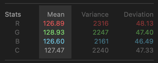
The histogram mean value is also called “average”. It sums up all the values in the histogram bins and divides them by the number of values. This is done for every single color channel.
The three resulting values can be expressed as mean color like RGB 128,128,128 is neutral gray or L*A*B 50,0,0. Adding the RGB values and dividing them by the number of channels (three) will give us the mean composite brightness.
Variance
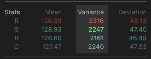
Variance is the spread around the median. While two different images can have the same per channel median, they can have a different variance. Variance is strongly related to histogram deviation (stdDev). You will need to know variance before stdDev can be calculated.
A larger variance value means the histogram spreads more widely around the median. It “varies” more. For an image, that means contrast is higher, the larger variance is.
The variance values are primarily useful for comparing different images in terms of contrast. For example if you want to compare different scanners, cameras or lenses for finding out which device offers more native contrast. Native lens contrast is an indicator for optical quality, as lenses that are prone to flaring will reduce contrast in certain situations, just like a scanner with a hazy mirror.
Deviation
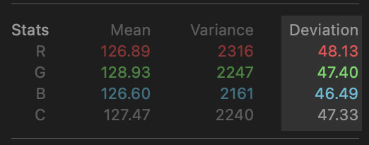
Deviation is the spread around the median. While two different images can have the same per channel median, they can have a different deviation. Deviation is strongly related to histogram variance . You will need to know variance before stdDev can be calculated because the deviation is the square root of variance
A larger deviation value means the histogram spreads more widely around the median. It “deviates” more from the median. For an image, that means contrast is higher, the larger deviation is.
The deviation values are primarily useful for comparing different images in terms of contrast. For example if you want to compare different scanners, cameras or lenses for finding out which device offers more native contrast. Native lens contrast is an indicator for optical quality, as lenses that are prone to flaring will reduce contrast in certain situations, just like a scanner with a hazy mirror.
User Interface – Clipping Section
The clipping section deals with frequencies of pixels reaching the end of the histogram canvas x-axis.
Min-PX

Min-PX shows the amount (frequency) of pixels currently in bin 0 of the histogram. The condition of a pixel in bin 0 is commonly called “clipping” or “drowning” black pixel. This condition is true for a black pixel, when it is in bin 0 of the composite channel while it’s actual information was NOT of the same value for every single RGB channel before it went to composite bin 0.
For explanation: If the before bin locus of a pixel was 20, 22, 18 it was not neutral and had informations about a color hue. After a too strong gradation adjustment it went into bin 0 of the composite histogram, what forced it to be RGB 0,0,0.
The correct locus for that particular pixel should have been RGB 2,4,0. What makes it a composite channel pixel in bin 3 (2+4+0=6; 6/3=2).
In conclusion, it is important to be aware of the fact, that RGB color clipping is ok, as long as the user is aware of the composite channel not clipping too much and as long the user wants to keep his work as mathematically non-destructive as possible.
Hence, the clipping section is important for archiving but not neccessarily affecting artistic work.
Max-PX
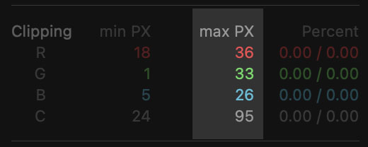
Max-PX shows the amount (frequency) of pixels currently in bin 255 of the histogram. The condition of a pixel in bin 255 is commonly called “clipping” or “blowing” white pixel. This condition is true for a white pixel, when it is in bin 255 of the composite channel while it’s actual information was NOT of the same value for every single RGB channel before it went to composite bin 255.
For explanation: If the before bin locus of a pixel was 230, 228, 232 it was not neutral and had informations about a color hue. After a too strong gradation adjustment it went into bin 255 of the composite histogram, what forced it to be RGB 255, 255, 255.
The correct locus for that particular pixel should have been RGB 253,251,255. What makes it a composite channel pixel in bin 230 (230+228+232=690; 690/3=230).
In conclusion that means, it is important to be aware of the fact, that RGB color clipping is ok, as long as the user is aware of the composite channel not clipping too much and as long the user wants to keep his work as mathematically non-destructive as possible.
Hence, the clipping section is important for archiving but not neccessarily affecting artistic work.
Percent
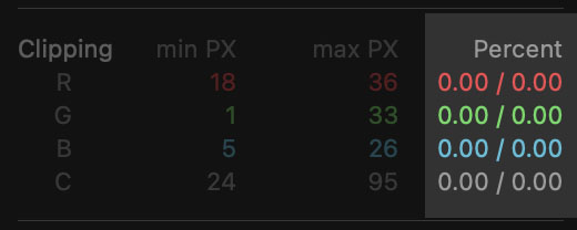
Percent shows the percentage of clipping pixels currently in bin 0/255 of the histogram in the single and composite color channels in relation to the overall amount of pixels of the document.
User Interface – Endpoints Section
The endpoint section deals with frequencies of pixels not reaching the end of the histogram canvas x-axis.
Min-Bin
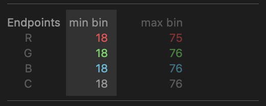
Min-bin shows the calculated values where the darkest pixel in the channels is located.
For example when we have a histogram for that min-bin shows a value of 20 in the red channel. That means the darkest pixels are currently located in bin 20 of the red histogram. At this point min-PX will show 0 because there are no clipping pixels in bin 0.
We would then create a levels adjustment layer and drag the blacks adjustment slider in the red channel to 20. Then the plugin will show min-bin as value 0. Because the darkest pixels are now in bin 0 after we dragged them there. Now min-PX will show the actual amount of pixels being in bin 0.
This process is called “histogram normalization”. Normalization is “grabbing” the histogram’s “hands and feet” and stretching them to the very ends of the histogram bins.
Min-bin can be used for manual normalization or for monitoring any type of automatic normalization or other methods of altering histogram endpoints.
There are easier ways in Photoshop to do manual normalization, like holding alt/option while dragging a levels layer slider. But it won’t show you the clipping pixels in numbers. We suggest to combine both.
Max-Bin

Min-bin shows the calculated values where the lightes pixel in the channels is located.
For example when we have a histogram for that max-bin shows a value of 230 in the red channel. That means the lightest pixels are currently located in bin 230 of the red histogram. At this point max-PX will show 0 because there are no clipping pixels in bin 255.
We would then create a levels adjustment layer and drag the blacks adjustment slider in the red channel to 230. Then the plugin will show max-bin as value 255. Because the lightest pixels are now in bin 255 after we dragged them there. Now max-PX will show the actual amount of pixels being in bin 255.
This process is called “histogram normalization”. Normalization is “grabbing” the histogram’s “hands and feet” and stretching them to the very ends of the histogram bins.
Max-bin can be used for manual normalization or for monitoring any type of automatic normalization or other methods of altering histogram endpoints.
With v1.1.0 we introduced the set-button. It will create a levels layer and enter the values automatically without clipping pixels.
Set-Button
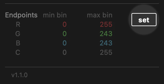
The set-button will create a levels layer with the name “BM-Endpoints” and enter the values of min bin and max bin automatically with -1 increment in the blacks and +1 increment in the whites for the RGB channels
That means if min-bin for the red channel is 20 and max-bin is 230, “set” will enter 19 and 231 for preventing pixels being clipped in bin 0 and bin 255 of the histogram.
This process can be called “lossless clipping” or “lossless histogram normalization”, where the endpoint pixels of the RGB channels are stretched to bin 1 and bin 254 of the histogram.
While it can happen that a scene needs unequal endpoints in the color channels for true color representation, usage of the Align-button is to be preferred over using the Set-button. Such an image would suffer some kind of color cast when the Set-button is used.
The Set function won’t show any effect with images that are already clipping in the RGB channels.
Align-Button

The align-button will create a levels layer with the name “BM-Endpoints” and enter the values of min bin and max bin automatically with -1 increment in the blacks and +1 increment in the whites for the channel with the highest spread on the histogram canvas
That means if min-bin for the red channel is 20 and max-bin is 230, “align” will enter 19 and 231 for preventing pixels being clipped in bin 0 and bin 255 of the histogram, but only for the channel with the lowest value for the black bin and the highest value for the white bin. The other channels will be “aligned” by trimming only the amount of bins that were used to trim the channel with the highest spread.
This process won’t change the color appearance of the image. It will clip all channels but the channel with the highest spread with the same amount of bins, the hisghest spread channel was clipped with.. Which channel had the highest spread can be read in the clipping section after aligning. This particular channel won’t have any pixels clipped.
Align works well with images that have leeway on both sides of the histogram. It is the best method of normalizing an image while keeping the color appearance and preserving a maximum of details without normalizing the composite RGB channel, what would lead to loosing more details.
Images with already clipping pixels in one channel on both sides of the histogram can’t be normalized with this function.
User Interface – ConSpector Panel
What ConSpector is
A plugin like BalanceMaster can consist of an arbitrary amount of panels. The ConSpector panel is a functional addition to the main panel.
A user can start the ConSpector panel from Photoshop’s plugin menu. The panel is located in “Plugins > BalanceMaster > ConSpector”.
The ConSpector panel fetches the average colors of the documents currently opened in Photoshop and visualizes them one under another in rectangular boxes in the panel.
On the left side the respective color designations in HSL are shown on the visualized average color swatch as a background.
On the right side, the panel shows the referring document name and the average color in the L*A*B color model.
Inbetween both areas is the “perceptual beam”. The perceptual beam is always as tall as all color swatches together. It shows the sum of average colors of all open documents.
By clicking on either the left or right area, Photoshop switches to the referenced image. From there, the image can be corrected to match the colors of the other documents by either using Photoshop’s native adjustments or by using the BalanceMaster plugin.
Opposed to switching documents within Photoshop, switching in ConSpector won’t fire a sync event, what allows for faster comparison between images.
Refresh Button
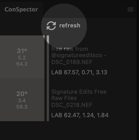
For convenience, the “on set adjustment” option in the preferences dialog can be checked, which allows the ConSpector panel to sync to the user’s adjustments while instantly showing the effect in the ConSpector panel’s colors.
Calculating histograms for multiple documents with adjustment layers can take some time and can be annoying on slower machines if “on set adjustment” is checked.
The manual refresh button on top of the panel can be used to sync the documents colors to the ConSpector panel manually and “on set adjustment” can stay unchecked.
Usage Examples
Using BalanceMaster for correcting color casts
So you read the whole user guide (hopefully not) and now you arrived here and you still think “Man, what is that guy talking about? A histogram is just that: a histogram!”. And you are right. Kind of.
A standard histogram doesn’t say anything about the content of the image. It doesn’t know if it’s blue because the image has a color cast or because you shot a photo of a blue wall.
Actually, you could even judge by the data in BalanceMaster if it’s a blue wall or a color cast by looking at saturation and delta E. A blue wall would be a lot more saturated than a color cast and delta E would be higher. But things are getting more difficult if you shot a desaturated wall, right?
We now realize it will be hard to color correct blue walls. Bummer!
What you could do is making a series of shots of blue walls consistent. For that we have ConSpector. Or in case your are color blind, BalanceMaster could at least tell you that your blue walls are actually cyan or purple and you could remove greens or magentas from the blues. So our little plugin would still prove quite useful for plain color images.
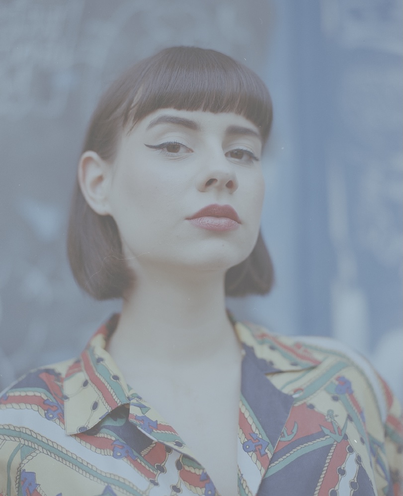
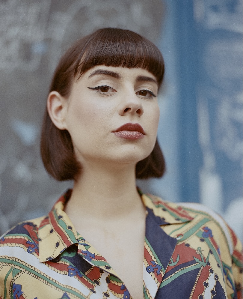
But what about the real life examples? Like sundowner portraits ? You can’t drag the sliders in BalanceMaster like wild for making the average color of an image plain gray. I mean you can do that, but it will look like…well… So for our sundowner example, we need a “pleasing” average color result. It’s a bit about expectations. Like what you expect the result to look like. For a sundowner, that would probably be something in the orange hue area and it would be quite saturated, depending on the scene.
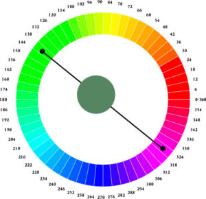
“Depending on the scene” brings us back to our initial problem with the blue walls. A beach scene for example can appear nearly neutral when averaged. That is because, let’s say half of the image is blue, what is our sky. And the other half is yellow, what is the sand.
Now when these two colors are averaged, they appear as gray. This is because yellow and blue are so called “complimentary colors”. On a 360° hue color wheel they are opposite to each other. And when you mix them, a new color is created, that is gray. Like so:
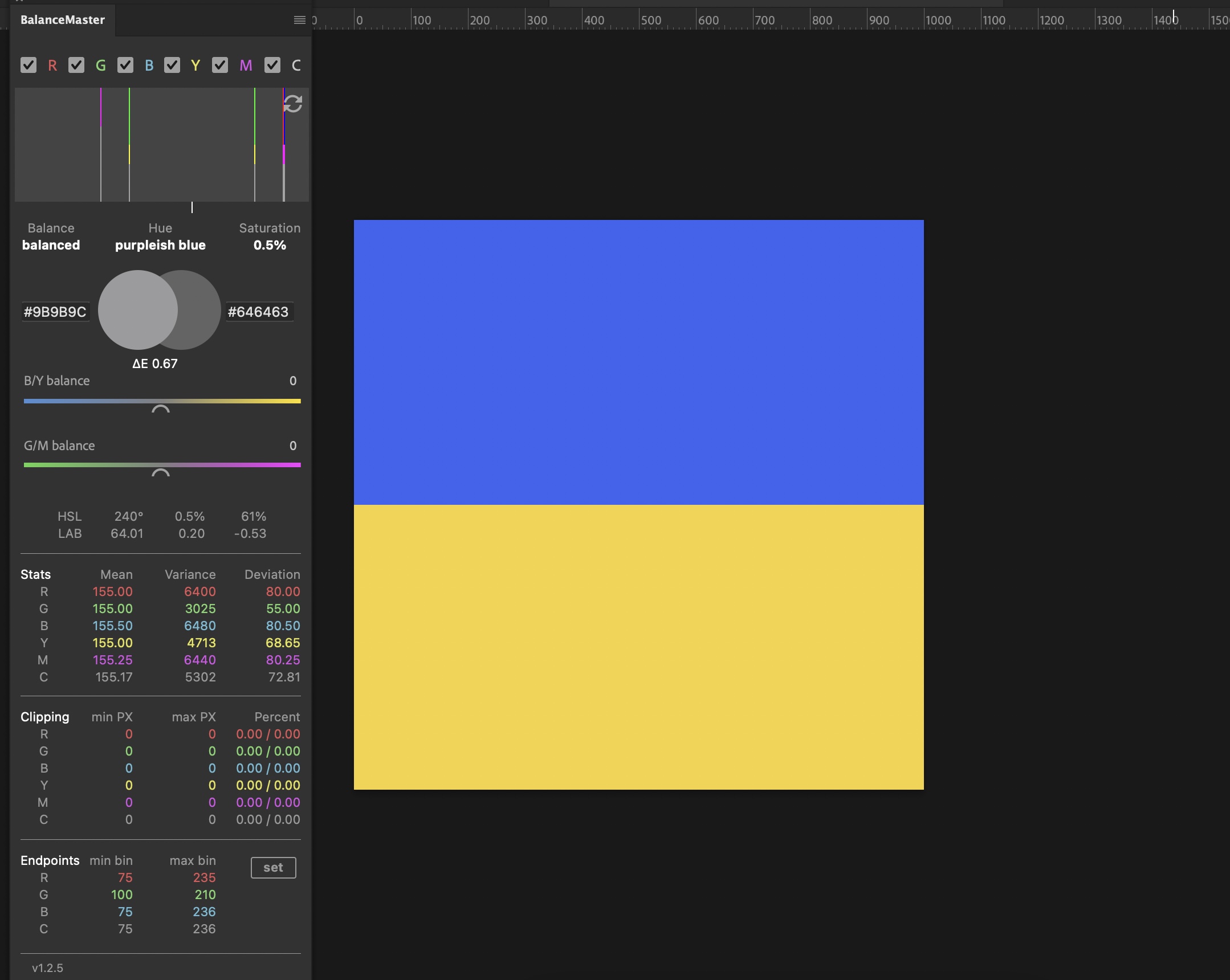
Let’s say this is our beach. This “beach” has a yellow with 50° of hue and the “sky” has a hue on the exact opposite side of the color wheel. That is 50°+180°=230°.
So we have HSB 50,70,95 on the bottom and HSB 230,70,95 on the top. I divided the image exactly in half, showing 50% yellow and 50% blue. A visual representation on the color wheel may help understanding this better.
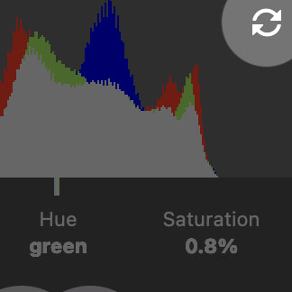
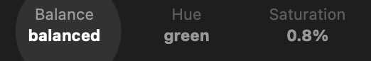
In BalanceMaster, the average and inverted average colors both show a perfect “color-less” gray and the balance indicator shows “balanced”.
It may be surprising for you that delta E is not exactly zero, saturation shows 0.5% and Hue shows “purpleish blue”. Although both colors have the same saturation and brightness. This is legit and i’ll explain below* why this is. But let’s ignore this for now and let’s judge our 50/50 beach scene as neutral.
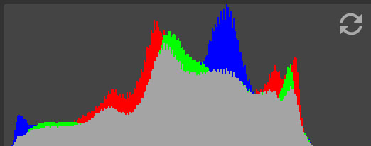
As good landscape photographers we would follow the rule by thirds and we would create another shot showing 66,6% sky and 33,3% sand:

And we have a totally different picture with totally different values. Actually, this is not even the same scene as saturation is far up and delta E is like from another planet.
But! And that is one of the important points about the plugin now. There is always some indicator that tells us what is wrong with an image. In this case the Hue designation still tells us “purpleish blue”. You can’t really mix purple from straight yellow and straight blue.
So something is wrong. And that is a tiny bit of magenta or red that doesn’t belong here. A color cast correction should always happen by “adding” the color complementary to the color cast to neutralize it. You can also turn it around and “subtract” the color cast by removing a color, but for now we’ll stay with the concept of adding, as it’s typical for photography since the early days of color cast correction with enlargers in dark rooms. This process is called “complementary color cast correction”.
As our image is now 66% blue vs 33% yellow it should appear as pure blue in the hue designator. Be have a magenta color cast, what makes it appear as purpleish blue.
By inducing green and we can neutralize the unwanted magenta. The color wheel is our friend again for understanding the process.
Now we know that the enemy of our magenta-ish color cast is green. And after dragging the G/M slider a bit into the greens we get this:
We compensated for the “unexpected color cast” in our beach scene. The Hue designation says “blue”.
Thing is, it’s not always that easy. Especially when it comes to real life. And that is why i want to to dive into the quotation marks around “unexpected”. Because that is what BalanceMaster is about. We want control and meet expectations. And that means to learn when a color cast in the average colors is to be expected or when it is unexpected. Hence our next example:
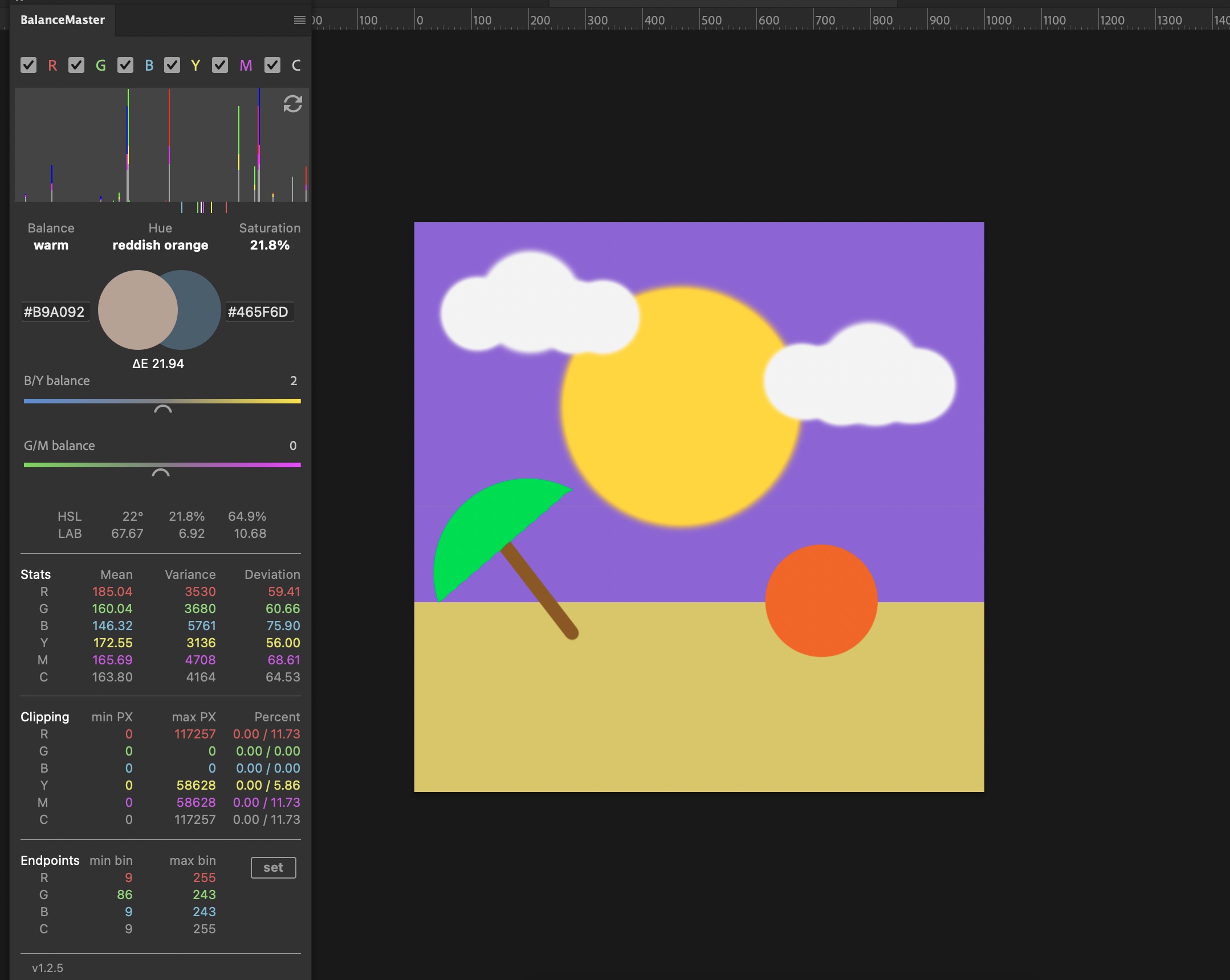
I admit my painting skills in Photoshop are … juvenile. But i somehow managed to create a sundown situation. A ball, clouds, purple sky, a green parasol. All that real life stuff that is so complicated to deal with.
Ok, this example is far away from reality, but what i’m after is, it does meet our expectation. It’s warm balanced, reddish orange with saturation in the 20 area. That is plausible. What wouldn’t be plausible is a green color cast. This is what i mean when i say unexpected or expected. I could say as well plausible or implausible.
Here comes an example with unexpected average colors:
Why does this one show yellow as an average color? I mean, around 40% of the image is blue sky, the rest is more red or orange. I would expect something like orange. And i would not expect the sky to be so fluo-cyan. Especially not in the evening. Maybe this is possible, but for me, this comes unexpected. So i guess there is too much yellow and/or green in there. Especially green as the sky looks like blue+green (turquoise).

And after dragging the sliders until the Hue said “yellow-orange” the image already feels a bit more neutral and natural. I admit, there is more work to do, because this is an image taken from Pixabay, obviously with some kind of preset applied. It would need further corrections in HSV, especially for the sky and the skin. But you get the basic idea.
One thing to note is, that whenever you have a color cast in an image, the average saturation and delta E will drop while correcting. That is an indicator that you are correcting into the right direction. But it’s still no guarantee for the image being neutral. Because delta E and saturation refer to plain neutral gray and not to the neutrality of the scene. And you don’t want an image to be neutral gray if it doesn’t work for the particular scene.
As a rule of thumb, the delta E and saturation will drop until another color cast from the correction is induced. And this is called “over-correction”.
There are images that can be corrected to “mathematical neutrality”. Typically these frames are 50/50 complementary colors. Like a person with yellowish skin tone in front of a light-blue wall. But generally, you will want to keep things on the warm, more pleasing side as long the image doesn’t serve a special purpose.
Hence a more demanding example. This time we’ll start with a DSLR RAW file out of a Nikon that suffers a problem with WB, that can’t be corrected well in the Camera RAW module because of a weird light/color situation.
I’m using a Neglin linear camera profile for it as a most neutral starting point, as Adobe’s camera profiles tend to even worsen problems with their sometimes weird color science. They offer the advantage of being most neutral on the gray axis and being linear in brightness without subtracting the black point. They were designed with editing in mind. Whenever it comes to difficult images i will edit them from from the ground up, because i don’t want any weird things going on that are not under my control. This is the case for Adobe standard profiles.
However, after this advertisement for one of my other products, let’s see what we’ve got here.
Interestingly, the plugin reports a magenta hue although the image looks rather green. Actually it really has a magenta tint, but we can’t see it because of missing gradation.
Because of the profile’s linear brightness we can see, that the image is a bit underexposed. About three quarters of a stop i would guess. Another effect of the linear brightness and the missing black subtraction is a lot of leeway to the left and right of the histogram canvas. You can see that by looking at the endpoint section. We’ve got around thirty empty bins in all channels on both sides. That’s why i decide for normalization of the histogram first by clicking on the align-button:
The align function does not stretch all channels to the histogram max and min bins like the set button, but takes the channel with the most stretch on the canvas as a reference for the other channels and aligns them with their previous positions. As a result, the color of the image won’t change, or will only change slightly. You could say the image is “naturally” normalized. This is the best method for DSLR photos, while negative scans work better with the set function.
However, the result is still quite dull, but i didn’t loose information in the highlights or shadows. The next step is adjusting brightness. I won’t say exposure, because exposure can never be changed. Exposure happens only when a sensor or film is exposed to light. Dragging an exposure slider in PS/LR or ACR should better be called ISO.
I decided to create a levels layer and adjust composite midtone brightness to 1.25. This was the value when BalanceMaster showed me 128 as a mean for the composite channel, what is in my opinion always a good starting point, as it equals a mathematical correct exposure. As you can see we still preserved all details without clipping pixels.
Obviously, the image needs some gradation now. I wont be too fancy and will simply use a contrast layer for this.
I added a whopping 70 increments of contrast without clipping anything. The image is still quite dark although the means have risen to 135. The culprit is the white shirt here, as it’s a quite huge element in the image.
Anyways, this is a good state for judging color casts. The plugin shows a very low saturation and delta E and even the balance indicator says the image is in balance. The question is: Is it in perceptual balance or only in mathematical balance?
As i said, this image is more demanding. Especially because we didn’t shoot it ourselves and we don’t know what the scene really looked like. We can’t even say what the walls should look like. Is a yellowish-green plausible for tapestry? Sure it is. Or could that just be a color cast and the walls were gray? Yes, that could be. But i think not, because removing green will lead to Rosacea on the subject’s face. Remember, you would correct a green color cast by inducing the complementary color magenta.
So all in all this seems to be more or less correct as it is. This photo was shot near a window in an overcast or blue hour situation. Hence the slightly blue shirt.
Thing is, it doesn’t really look pleasing. Commonly i would say this is none of our business. It’s the photographer who chose the light situation. But are we common today? No we’re not.
So let’s use BalanceMaster to push the image to somewhere near the neutral limit at least without overshooting things and make it a bit more interesting by inducing a pleasing color cast until BalanceMaster tells us the image is out of balance.
Let’s do this:
This is my result and i’m quite happy with it because i nearly lost no details as you can see in the clipping section’s percentage area.
I set the black and white endpoints in the composite channel a bit tighter. This induced more contrast without changing the color of the image.
Then i lifted midtone brightness a bit in the same channel. This can all be done in the BM-Endpoints levels layer we already created by using the align-button.
Then i dragged the B/Y and G/M sliders into the warm directions by watching the balance indicator. As soon as it indicated a warm balance, i stopped. Skin tones are now ok but could need some hue adjustment and micro dodge & burning. But that’s no job for our plugin.
Important is, that our image is now ready as a master for ConSpector or for retouching.
*Explanation to values being not zero:
This is because BalanceMaster is so accurate in what it does. it recognizes a slight red color cast in the overall image because both colors are not “pure” yellow or blue but have a slight shift into the reds of the color wheel. And it sees a lower variance for the yellow mean value than for the blue mean value, what makes the image have a “higher weight” on the blue side. Then it sums up both colors: blue+red=purpleish blue with 0.5% saturation.
Delta E is not zero, because of the before mentioned purpleish cast and because brightness deviates from the inverted image, meaning the L value is not 50, as to be expected for neutral gray L*A*B* 50,0,0.
Using ConSpector / perceptual beam
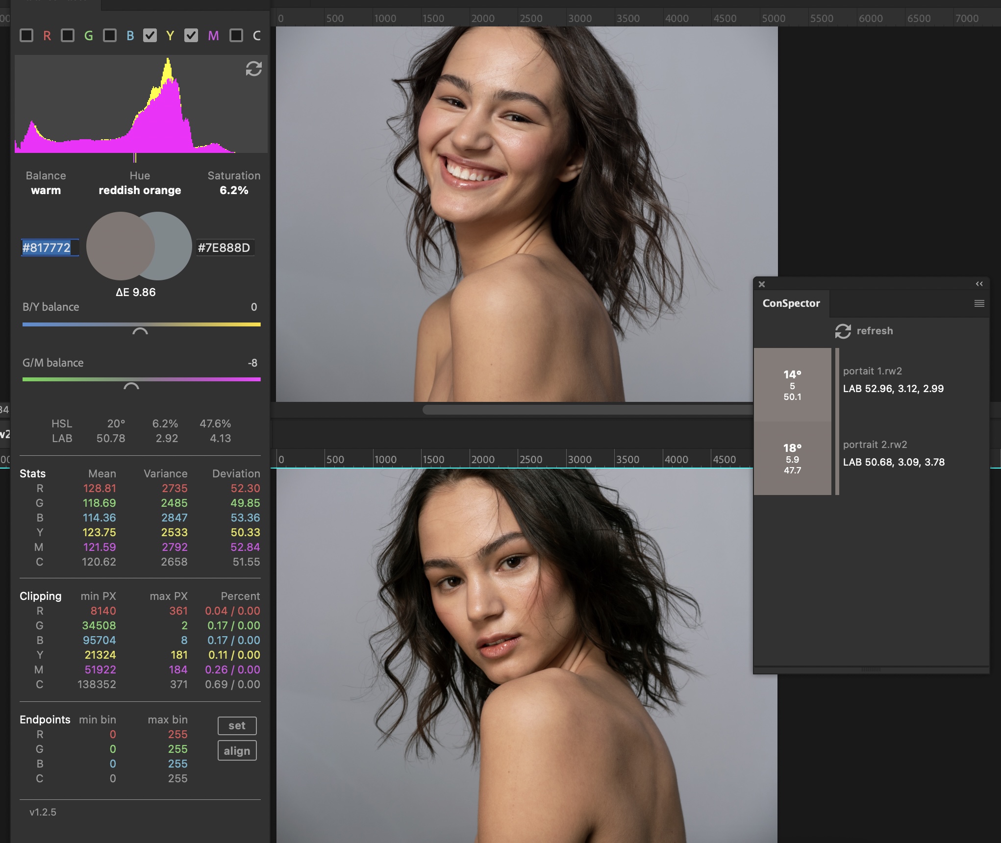
Imagine you want to prepare a photo exhibition, build up your Instagram account consistently, supply an agency with a series of images or you have promised a wedding couple prints for their living room wall. You want to deliver consistent work.
Photographic consistency has always been synonymous with reliability and professionalism. The client sees consistent work and concludes that the quality of your work will be at a consistent level. WYSIWYG – What you see is what you get.
When they see an image in a series that is somehow off, they’re gone. Or at least they feel insecure.
This is where BalanceMaster’s ConSpector chimes in. It’s a tool for “proofing” and altering consistency for a series of images. You will use it for judging deviations between images.

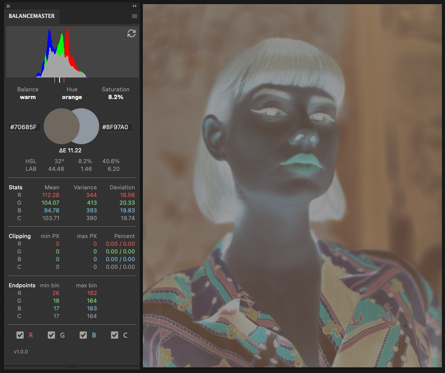
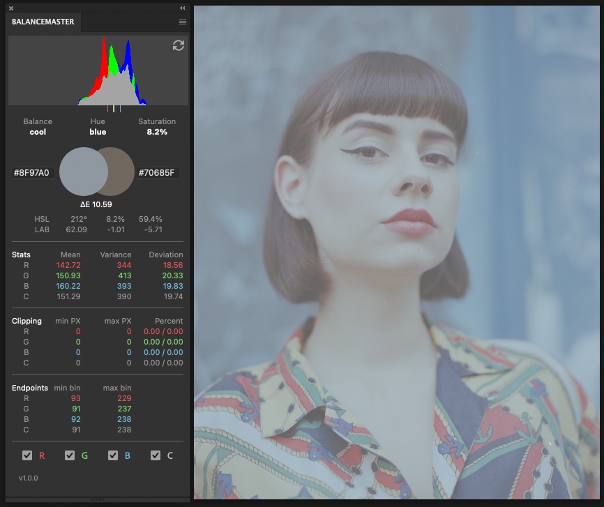
I have opened two images from the same scene. The ConSpector panel is on the right and syncs to my adjustments.
The values indicate, that the images have a color cast and they obviously have a red tint. So the first step should be making a color corrected “master” to which we adapt the other image later. How you would do that is described in the color correction example.
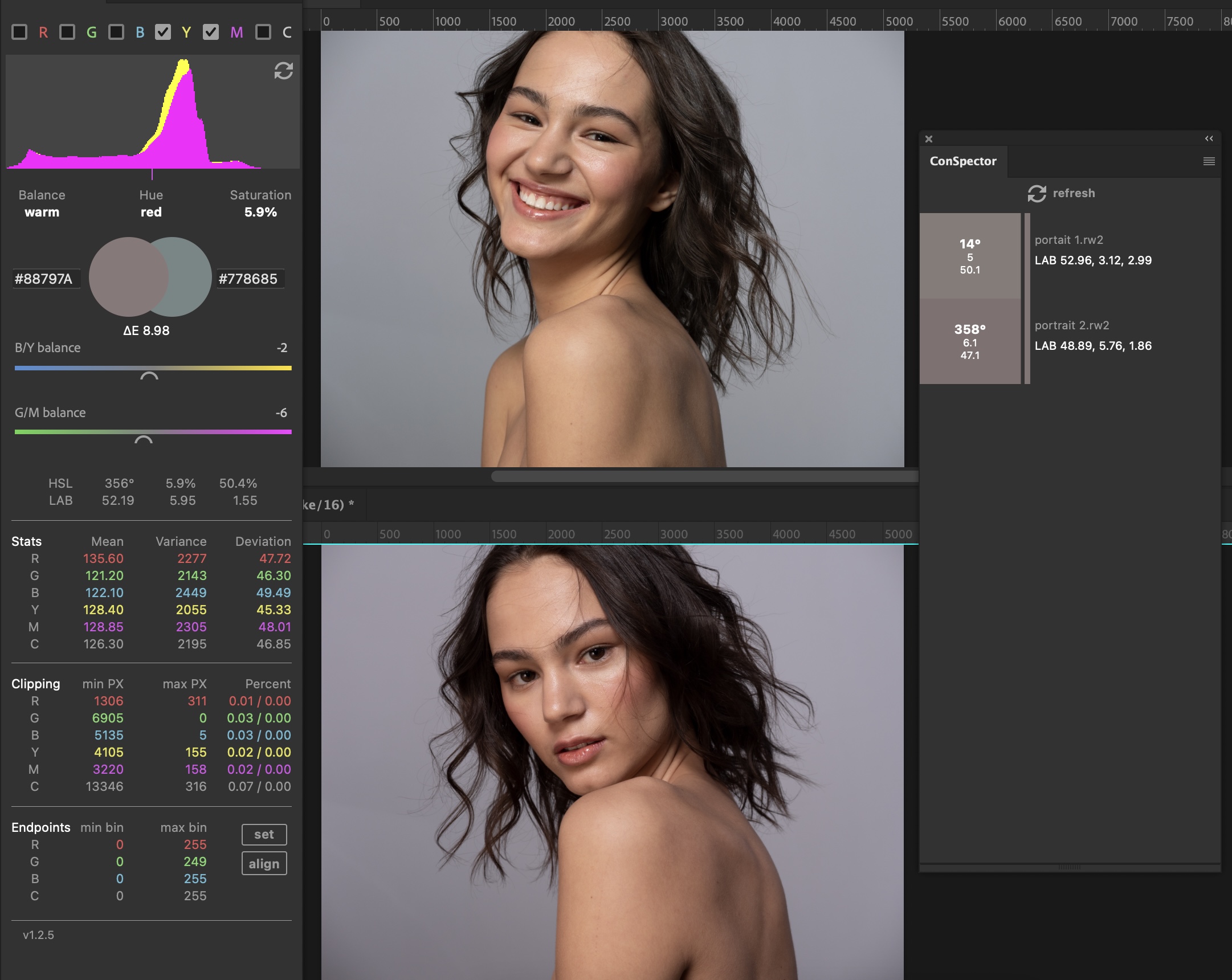
Here is my master on the top, with the document to adapt on the bottom.
You may wonder why the master looks green in comparison. That is because our brain is tricked in A/B comparisons. God (or Darwin) implemented some kind of complementary function there. You can try that yourself by looking at a, let’s say, red ball for a minute and then look at a white wall. What you will see is a turquoise ball on the white wall. Interesting right?
There was a name for this effect, but i forgot it. Offtopic: I remember very well when i was working for a photo studio, where i had to retouch portraits of employees of a german bank, who all head red neckties. I did this for months. Ten hours per day. I saw tourquoise neckties all over my living room walls the whole evening.
Whatever, that effect is a problem for A/B comparisons. Especially when one image has a strong color cast in the grays while the other is supposed to be neutral in the grays. That can easiliy lead to an “editing-loop”, because whatever you do, the image never appears to be neutral. That is why you should edit the master without being distracted by other images. Make sure PS covers the full screen, have a neutral gray canvas (the middle gray template in the PS appearance preferences) and you’re good.
When you’re done, you can call ConSpector and load the other images of the scene and tile the windows like above. It makes sense to copy the adjustment layers of the master to the “slave” images. At this point you can start comparing average colors with ConSpector. It will give a good overview of the color deviations of the documents you have currently open.
Now it’s very tempting to adjust all images to have the exact same values. But that probably wouldn’t work because even the slightest change of the scene will result in a slight change of the values.
Instead, it’s better to have a look at plausibility again. Like “This image is far off. Why is that and is that plausible? Do i need to change it?”.
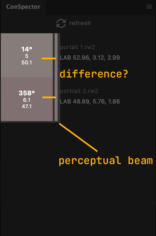
This is where the perceptual beam comes into play. It’s the average color of all documents currently open. We’re tricking our brain a bit by having that little margin between the color swatches and the beam. It makes it much harder for our eyes to compare the colors between the beam and the swatches.
So you would read the color swatch first, then your eyes move over the margin to the beam while trying to compare each other. If you notice a difference between the beam and the swatch, you will likely want to edit the referring image for consistency reasons. If not, you’re good.
The ConSpector window is resizable in width and height. When you resize it in width, the margin will disappear slowly until it’s gone. Then the “effect” is lost and you will see a much more accurate deviation between swatch and beam. You would resize the windows to your needs. Every person is different in terms of tolerance.
So this is my result after adjustment. You can see there still is a slight deviation in values between both images. That is the plausible tolerance i was talking about earlier. I think this deviation is legit as the second portrait shows more hair, what slightly changes the tonality of the overall image. When comparing the swatches with the perceptual bar i’m seeing no difference, what means it’s good enough for my eyes and hopefully for yours too.
Manually converting negative film
*This is an example with an older version of the plugin. Since release v1.1.0 we have additional tools for correcting negative film*
In this example we will convert a negative using Photoshop’s native functions. After a basic histogram normalization by the plugin’s endpoints section, we will learn how to neutralize channel gamma. All with the help of the plugin’s values.
The photo i’m converting was taken by Lukas Büsse
This is Portra 400, scanned on an Epson V850 with Silverfast prepared with one of the linear profiles that come with Negmaster. It was white balanced in Adobe Camera Raw before. I chose the brightest spot in the scene i could find for WB. In this case the spot was below her ear.
White balancing means, you “pull” channel values together.
For example you would choose a spot with the RGB values 253, 250, 250, Camera RAW would try to neutralize this spot. So it would sum up the three values, which is 753. And then it would divide it by three, what is the number of channels. The result is 251, what is the average channel brightness of the spot.
And now it would force this spot to be 251, 251 ,251 and align the rest of the histogram to it.
If you hit the right spot, our plugin should show all max bins to be equal. And obviously i missed the right spot by a bit, as my values are 162, 164, 163. But that is a neglible amount. Camera Raw’s WB picker doesn’t seem to work on a single pixel anyways, instead it seems to average an area of pixels around the picker. So there is not much what we can do about that.
As you can see i already inverted the image by pressing cmd/ctrl+i. It doesn’t make sense to edit the image in negative any longer. It would just confuse us even more.
Ok, so let’s dive a bit into values and see what we’ve got here.
Judging the scan by values
The histogram is far away from being perfect. All the values concentrate around the medians. At least, the scan is quite well exposed. We’ve got a LAB L value of 62.09 out of 100, what tells us that we have an exposure in a neutral area around 50. The means in the stats say the same, they are quite near to neutral 128. The blue channel is the brightest and the red channel the darkest what explains the overall blueish color cast.
Balance says the image is cool becaue the A and B values are negative. We’ve got a blue average color with saturation of above eight and delta is above 10. If you read the guide about delta E you will know that deltas above 5 indicate a different color. That means our image is far away from being neutral.
Deviation and variance tell me all channels are quite equal. From experience i know, that these values are quite low. Low deviation gives you a hint on the scan not being very contrasty/saturated. But that’s not neccessarily a bad thing. Values between 20 and 30 are normal when using linear profiles. So this scan is on the lower end.
The endpoints are very interesting. The min bins are way more off than the max bins, indicating an underexposure of the scanner. Remember we are dealing with a negative scan. You can see that in the histogram. There is more empty bins on the left side than on the right side. But this is also ok. What it does to our image is that we will have to lower gamma a bit after normalization. Because our shadows and midtones will be a bit too bright.
Ok, so i think this looks quite good overall. So it’s time to stretch and massage the histogram for getting something like a real photo.
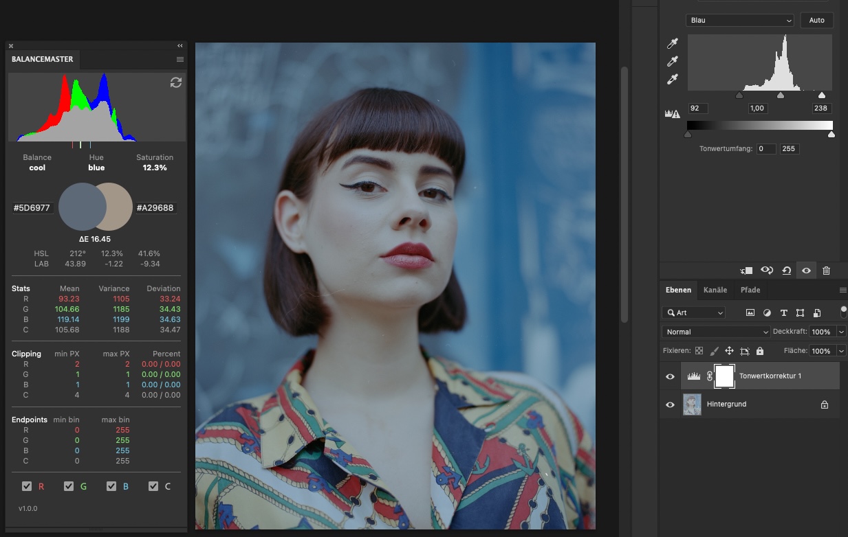
Histogram normalization by endpoint values
As you can see on the image above i’ve been busy in the meantime. What i did was making a levels adjustment layer and entering the values of the endpoint sections in the single color channels tabs of the levels layer.
For red 93, 229
For green 91, 237
For blue 92, 238
With release of Balancemaster 1.1.0 this can be done automatically via the Set-Button.
Now we can see a very tiny amount of pixels clipping in the clipping section of the plugin. This is really like nothing and the tiniest loss of information possible.
Things can get tricky when you have dust in your scans. You should remove it before manually converting. Same for sprocket holes or other residues of the light source. What you can do then is holding alt/option while dragging the levels sliders. Photoshop will show you clipping pixels then but it comes with at cost of loosing more information than neccessary. At least you can check how many pixel you have lost by checking the plugin’s clipping section and decide then if those values are tolerable or not. If not, you could correct your adjustments.
Judging the image after normalization
So we have induced a lot of contrast with setting the endpoints. We have nearly no clipping and all the endpoints min bin and min max values are in bin 0 and bin 255.
Not so good is, that our image is still cool, with a even higher saturation and delta E. But, no worries, this is normal and i’ve got a plan. And the plan is to adjust the midtone brightness of the single color channels by judging the mean values.
Ok, so when having a look at our LAB L lightness, i can see that we went down from around to 60 to the lower 40ies. As this image seems to be perfectly exposed on the analog side, i would like to see it in the 50ies.
So i go over to the Stats section and i can see that our blue channel is the brightest with a value around 120, while the other channels are around 100 and 90. Deviation is nearly on point except for the blue channel. That’s good.
I think we can get our image where we want it by lifting midtone brightness for the red and green channels and then our LAB L value should be around 50. That would be perfect. Let’s do this.
That’s our result
Judging the image after channel gamma
The plan worked out well! I’ve got all my values where i wanted them to be. LAB L is in the 50ies, the means are all close to equal. Delta and saturation is even down in the zeroes. That’s dream values. This is not because of my editing skillz. This is more related to the scene, because it’s a very balanced shot where nearly half the image is blueish background while the other half is yellow foreground. One of the reasons why this image is so pleasing. It works with complementary colors.
It’s not always that easy. But you get the idea.
Ok, so i still see work to do. The image is a bit too dark for my taste and i’m missing contrast. So this is what we’ll do next.
Adjusting final contrast and brightness
I won’t be too fancy about this. I’m using Photoshop’s native brightness/contrast adjustment layer for this, as in my experience it will preserve clipping pixels better than any levels or curves layer. This is since Adobe updatet the algorithms for this layer some years ago. I think it was in CS6 when they induced it. Since then we have the “use old version” checkbox there.
I decide to lift brightness only a tiny bit. A value around 10 seems fine. For contrast i choose 50 while watching the clipping values. Now i see some serious oversaturation happening primarily in the reds. Quite typical for an Epson V850 scan. Because of that i decide to use the blend mode luminosity for the contrast layer.
Yup, that is something i can live with. Contrast carves the face out of the background well, saturation is still a bit low as to be expected from the low deviation in the beginning.
So here comes our final result after converting to sRGB and removing a bit of dust and lint. I also added a bit of vibrance, what changed the color temperature a bit, but to the good i think.
This was the hard way of converting a negative scan. i wouldn’t do that for all my scans, but scans that are somehow hard to convert automatically or just for self-educational purposes.
But this process comes at the benefit of minimum clipping. What do we have in bin 0 and 255? 26 pixels! That’s close to nothing. Awesome. That means we have an image with good neutrality, fine contrast and it still has all the details, what is a good basis for further editing. On this example i would still like to adjust skin tones a bit. But that goes into retouching techniques and will maybe be covered another time.
Inspecting image areas selectively
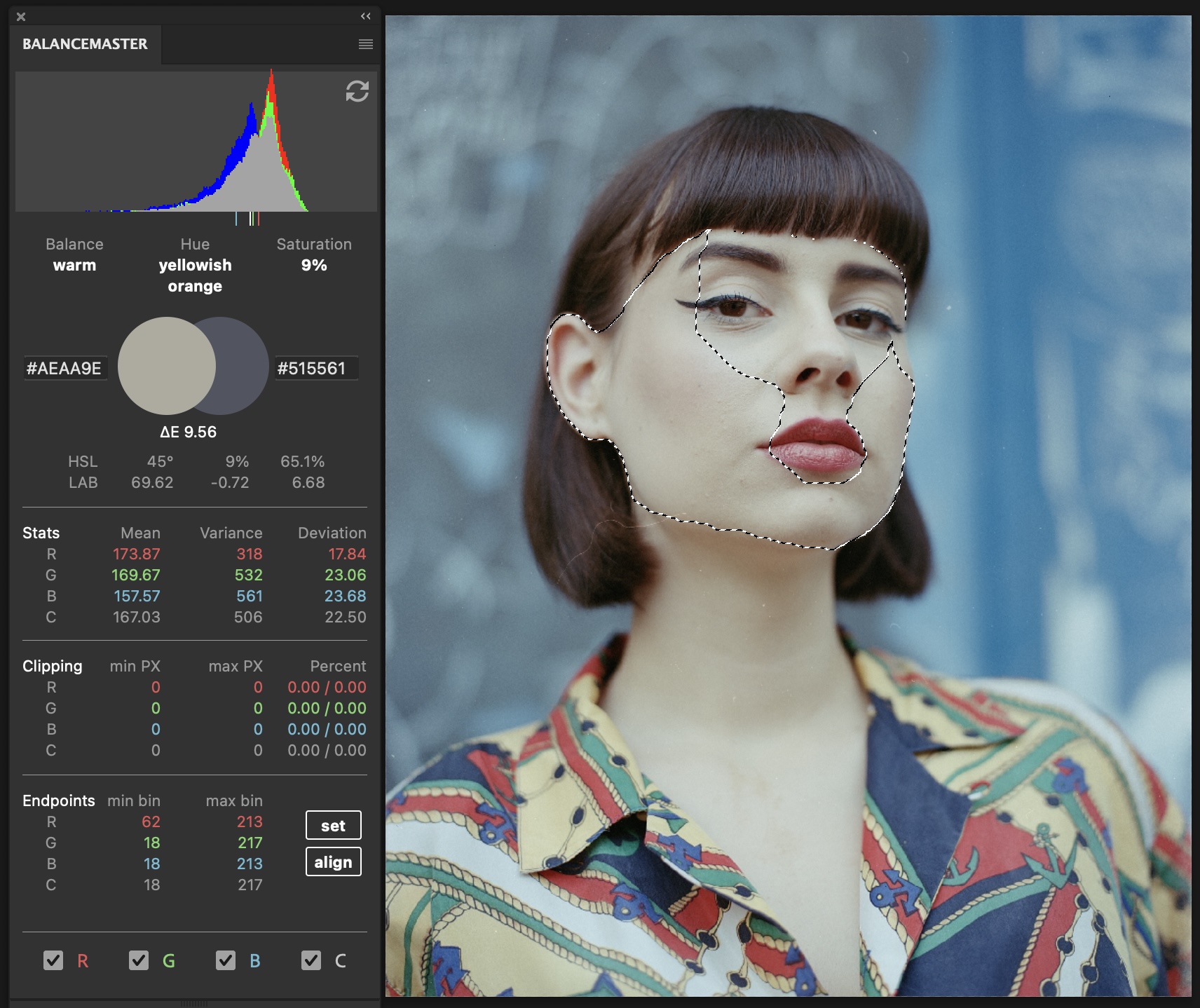
For judging areas selectively, we will work with selections. The easiest way to do this is to simply draw a quick selection (W) of an area we want to correct. For skin tones, we would select only the skin without hair, lipstick, eyes …
The screenshot above shows an example for correctly selected skin tones in a face.
At best, we draw the selection on the background layer. Or in case we already have additional adjustment layers, we should merge them to a new layer (shift+ cmd/ctrl + alt + E). Then refresh the plugin manually and the color values of the selected area will show.
Other
Changelog
1.3.0
Main panel:
- introducing the composite slider
- introducing the in app user guide
- RGBMYC checkbox states now saved to hard drive
- slight changes to UI design
1.2.9
Bug fixes:
- Fixes performance issues when recalculating the histogram
- Fixes Photoshop freezing when adjustment layers are set
- fixes update check intermittently working on MacOS
1.2.7
Bug fixes:
- refresh button in main panel will sync adjustments as a workaround for events that are out of scope for the plugin
- fix slider reset adjustment layer to 0 on right click
1.2.6
Preferences:
- added “on history change” event
1.2.5
Conspector:
- Introducing the “perceptual beam”
- resizable panel
- indicate active document
- beautified refresh button
1.2.0
- introducing the “ConSpector” panel
1.1.0
- introducing yellow and magenta histogram
- introducing edit functions: yellow & magenta balance; set endpoints button
- plugin will show notification to convert mode if document has no RGB channels
- longer color names now fit text field width
- checkboxes went to top of the plugin
1.0.0 – initial release